You can see the Covid 19 dashboard by clicking here
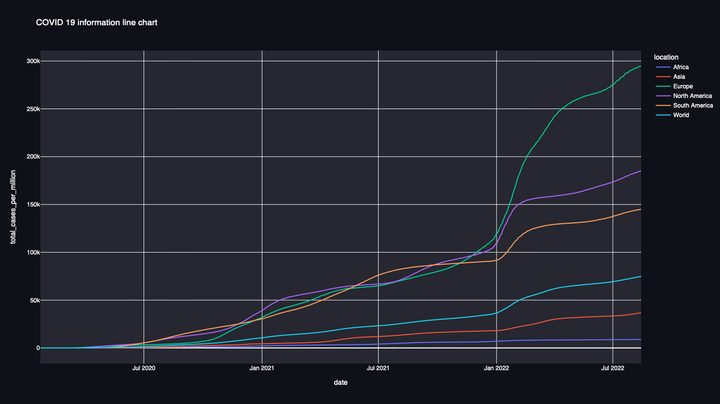
This dashboard shows the most important worldwide and countrywise parameters regarding the COVID 19 pandemic from January 1st, 2020 until today using Python and Streamlit.
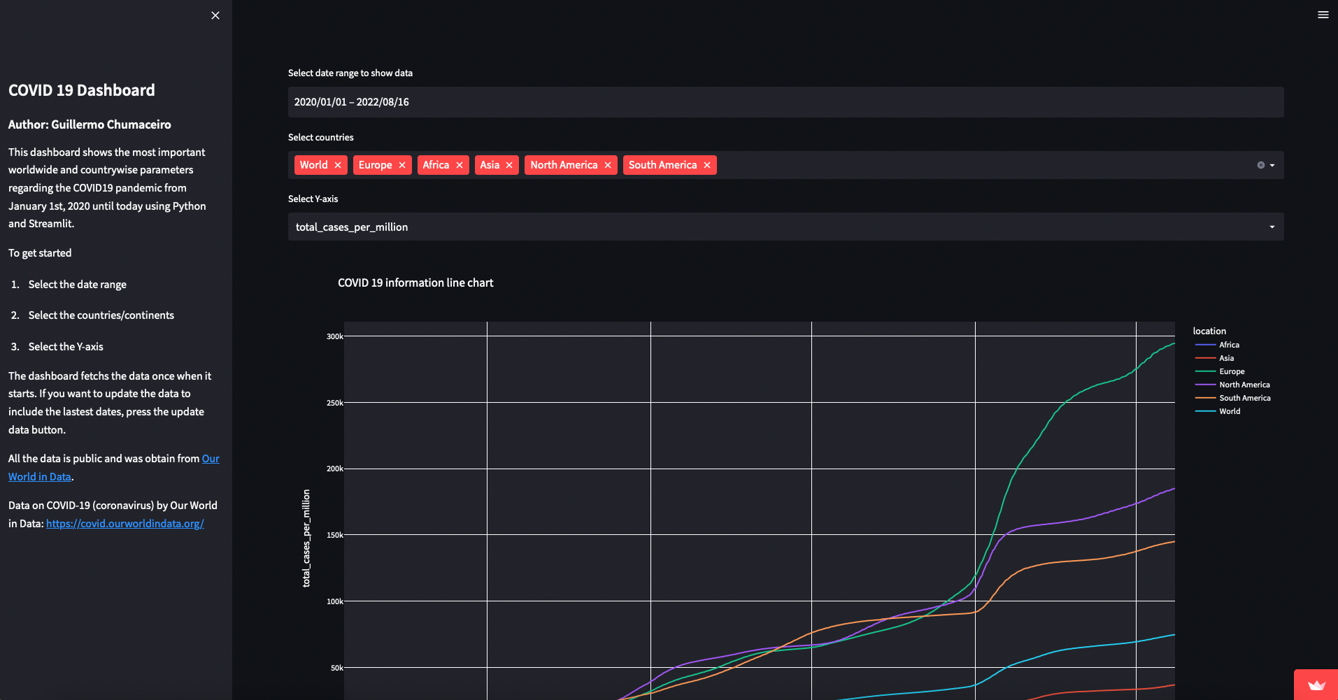
The interface is user friendly. You can select the date range and also the countries to display in the plot.
This is a screenshot of the interface.
This is a work in progress that will be updated over time.
As of August 16th, 2022, the app shows a highly customizable single plot on many important parameters, like: total_cases, total_deaths, new_cases, total_tests.